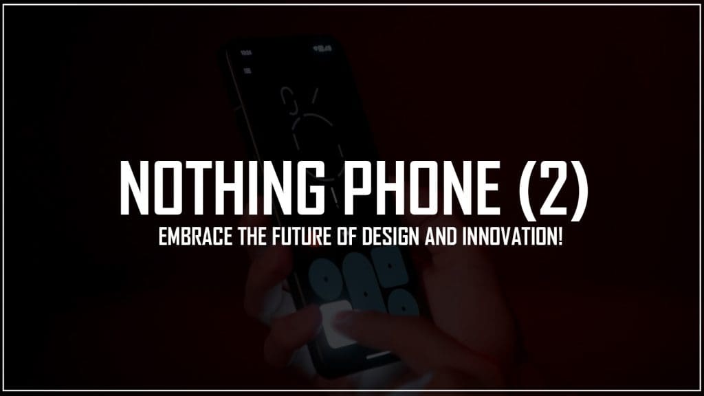
Get ready for the highly anticipated Nothing Phone (2) launch! Explore its transparent back design and unique features before the official event.
Prepare for the highly anticipated launch of the Nothing Phone (2)! This smartphone has created a buzz with teasers and leaks online. With its transparent back design and unique features, the Phone (2) promises to inject fun into technology. Nothing recently revealed the complete design ahead of the official event. Check it out!
NOTHING PHONE (2) – Making its Mark!
The design of the upcoming Phone (2) was revealed by YouTuber Marques Brownlee in a Dope Tech video. Nothing’s team also tweeted the official design. The video highlights the changes in design and introduces the new Glyph Interface. However, it doesn’t cover software, hardware specs, or hands-on experience.
A new era. Where iconic design meets premium performance.
A product of meticulous engineering and obsessive attention to detail. Our proudest design story so far.
Come to the bright side. Meet Phone (2) on 11 July, 16:00 BST. pic.twitter.com/ckgmAXCawi
— Nothing (@nothing) July 4, 2023
At first glance, you’ll notice the new grey colorway and slightly curved edges of the Nothing Phone (2). There’s also a white option available, and the display remains flat, with a centered front punch-hole camera cutout.
Furthermore, the LED strip design has been revamped. Instead of a continuous strip, it’s now divided into six parts around the wireless charging coil. The camera module has its own LED strips, totalling 33 lighting zones. The top right strip has 16 customizable lighting zones.
The Glyph lights are now more practical, serving various functions like displaying volume levels, timer adaptation, and notification indicators. They even show the progress of your cab or food delivery. The bottom LED strip and dot still function as a charging indicator.
These features are especially useful when the phone is face down, showcasing its distinctive design. Nothing aims to capture attention with this unique approach. Share your thoughts on the design in the comments below.


